New editorial brochures for Hayes and Jarvis
When Travelopia asked design agency Parker Design to create a new suite of brochures for them, I was bought onboard to project manage and edit them. All 6 brochures had to be redesigned and printed in just 12 weeks, just as I was preparing to go to Mount Everest…
We approached the design from a user perspective, and took a strategic approach to tell the Hayes & Jarvis brand story through striking visuals and highly insightful and engaging content. I came up with a new concept and new flatplans, bringing on board some of the brilliant copy writers and sub editors I’d worked with on previous projects.
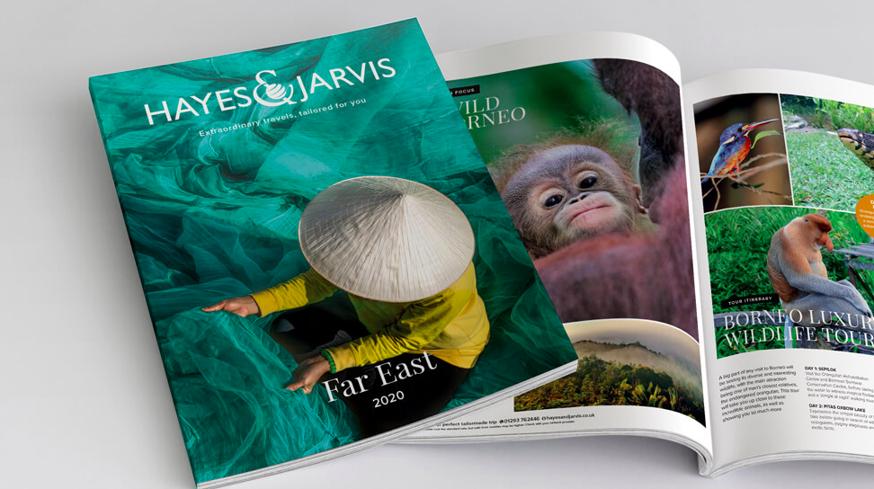
The new design was to be clean and clutter-free, with an air of timeless elegance coupled with life-changing adventure. The photography we chose for the new covers focuses on small details that speak volumes of a unique travel experience, and go to the very core of what Hayes & Jarvis audiences expect: an unforgettable holiday personally tailored by experts.
Our aim with the highly visual and pared down approach was to encourage target customers to phone a Hayes & Jarvis Destination Specialist to find out more.
We crafted compelling opening paragraphs for each section, with a focus on presenting each destination as an opportunity to enjoy the unforgettable experiences it offers. Whilst the overall look and feel is consistent, playing with different layouts helped us keep content varied and engaging.
Striking double spreads help introduce the different regions, with the pages that follow filled with detailed information on the wide range of options available. The new design, with its focus on enticing visual and written content, successfully get across the richness and idiosyncrasies of the local cultures travellers will be able to experience. Some of the page layouts in the Hayes & Jarvis holiday brochures nod to a prestigious travel magazine, immediately engaging readers’ imaginations and whetting their appetite.
“A big piece of work that ended in some pretty special brochures – something to be proud of!”


